All apps updated for macOS 13.0 Ventura
November 2022
November 2022
June 2020
After trying Timeless, Denied, Carbonize, Relax and Pipvid with the first macOS 11 beta, I’ve discovered they’re all working fine!
New releases tend to introduce (security) features that I need to comply with, but the first beta at least seems to be fully compatible. 👍
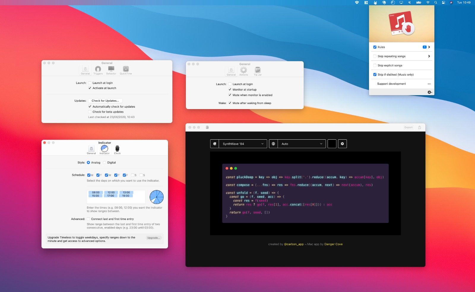
Here’s a screenshot of the apps running on the new OS. Notice the huge change in design.
I stick to default UI elements for most of my apps in anticipation of an event like this; every app immediately looks right at home with the new look. Apart for Denied, which could use with some rounded corners. 😅
April 2020
Clocks come in two different flavors: digital and analog. With Timeless’ latest update the same goes for the indicator.
If you found it difficult to determine exactly which range you were in previously, you’ll enjoy this new option.
Simply go into preferences and switch the indicator Style.
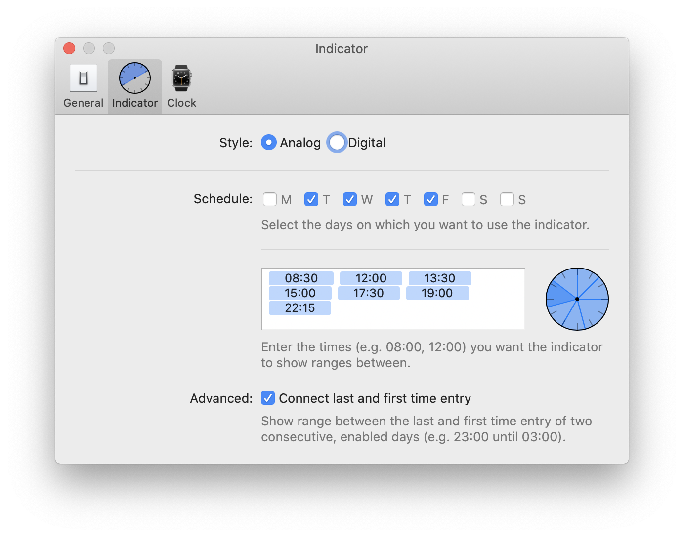
Go from this:

To this:

Get the update directly from me, from the Mac App Store or through Setapp.
April 2020
I’m proud and excited to announce that Timeless is now available through Setapp! 🥳
Setapp is an award winning service that offers unlimited access to a curated list of 170+ high quality Mac apps for just $9.99 a month. You can use tools like Bartender, CleanMyMac, Dropzone, iStat Menus, IconJar, Ulysses, Timeless (of course) and many more with one easy subscription.
If you’re a designer, programmer or another type of professional, you’ll appreciate the convenience and power that comes with having access to such a wide range of software.
I’ve been a longtime fan of Setapp and its collection of Mac gems 💎. It’s a great way to use Timeless and adds another path besides the direct download and Mac App Store through which you can keep your eyes of the clock and stay focused while getting work done.
March 2020
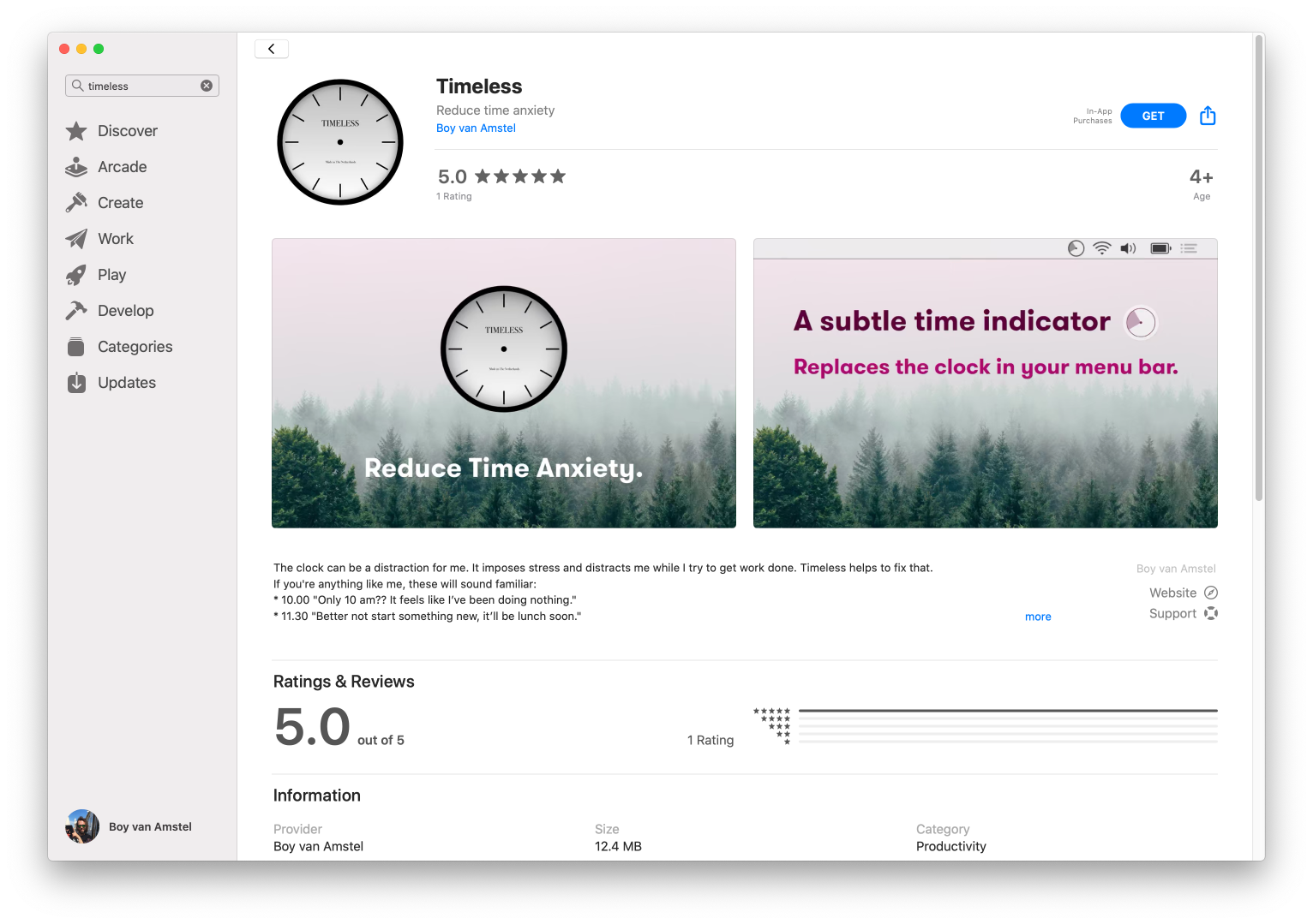
Timeless is now also available on the Mac App Store! It’s the exact same release you get from download it directly from me.
An in-app purchase unlocks the premium features. 🔐
With the new download option also comes an update for the non-MAS release. It contains mostly under the hood changes to accommodate the App Store release.
March 2020
The COVID-19 Corona outbreak has many of us working from home. It could be the first time you sit down at the kitchen table with a laptop. Maybe you’ve doing it for years.
In either case, I’ve made an app called Timeless that will make the experience even more comfortable – or bearable if you prefer the office.
Working remotely comes with unique challenges, among which distraction and procrastination. For me personally, the clock plays an important part in this.
Tell me if these sound familiar:
These moments will cause distraction, make me anxious or I’ll start procrastinating.
I made Timeless to fix this. It hides the exact time and shows customizable ranges instead. You lose the feeling of dread some hours on the clock might give you, while keeping a sense of time passing.

The key is stopping the clock. Not knowing whether it’s 11:00 or 11:45 will keep you from losing focus and stopping early just because lunch is around the corner. This doesn’t mean you have to work more, or longer. It’s about working more effectively. You could even alternate between work and leisure ranges. Don’t worry too much about starting a range exactly when you switch to it.
To give you an idea, this is how I setup my ranges:
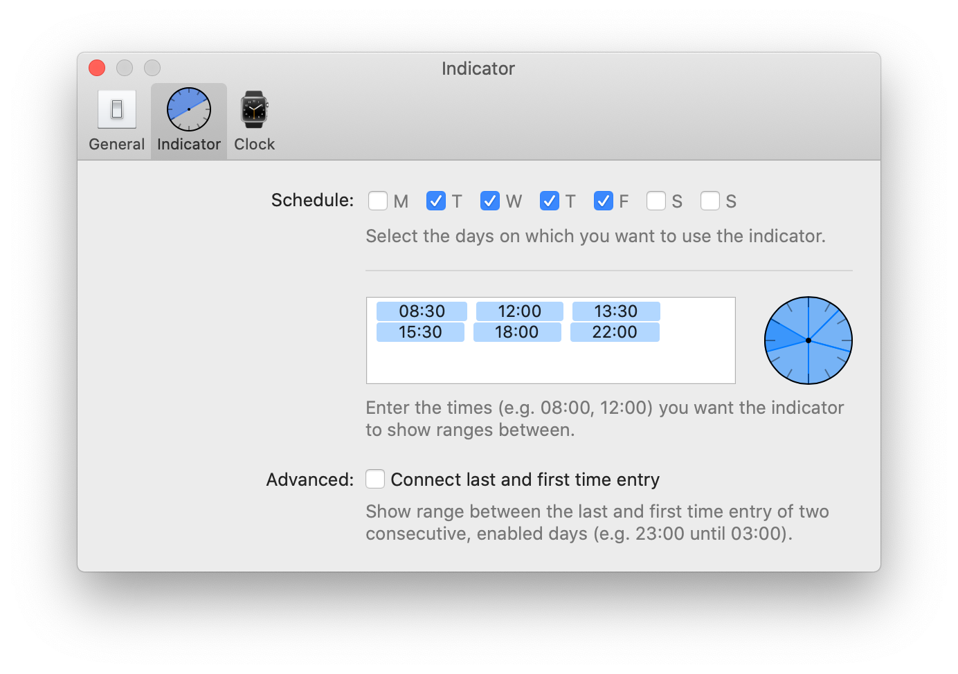
I don’t drop everything when a new range starts, instead it’s a hint that I might have to change what I’m doing. That’s why I have a 1.5 hour lunch range. I aim to get a sandwich anywhere in those one and a half hours. Some days it’s 12:01, others 13:20. 🥪
The best part is not being dictated by the minute on the clock. If I need to be somewhere, or have a meeting I set reminders and calendar appointments. The trick there is to set alerts appropriately; by taking into account the time I need to switch tasks.
If I got you excited, give Timeless a go by downloading the free version. Let me know what you think. And stay safe!
February 2020
A new version of Timeless came out this Friday! Besides a whole bunch of under-the-hood tweaks and improvements it introduces two new features that were requested by a few of you.
I’ve also switched to a more liberal versioning system. This is update came out in 2020 (2020.3) and it’s update number three (2020.3) this year. In a more traditional versioning system I might’ve called this is 1.5 or even 2.0 release. 🚀
Let’s start with the new features. They were both requested several times and I think they’re great additions.
Both are premium features that will be unlocked when you buy a license for Timeless.

This is a feature for night owls. Previously Timeless would create a range up to the last time entry, then turn idle until the first time entry the next morning. This won’t do if you’re getting something done between 10 PM and 3 AM. I’m excited to say that with version 2020.3 you can choose to bridge the gap between two consecutive, enabled days.
Simply enable the feature in the indicator preferences. That’s it. ✓
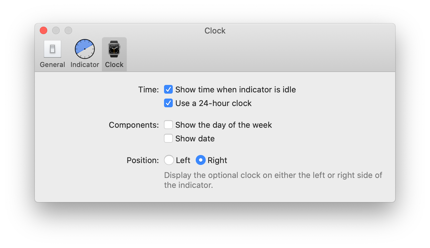
Originally Timeless would always show the current day and time when the indicator is idle. If it’s Friday at 20:15, it would say “Mon 20:15”. The new default is to just show the time, clean and simple “20:15”. You can optionally add the current day and even display the full date “Mon 17 Feb 20:15”, exactly like macOS allows you to do.
All date and time formats are of course displayed according to your current locale. 🌐
That’s it. A lot has changed in this release. If you notice anything out of the ordinary, click the ‘Timeless Help’ item and let me know.
Enjoy the update! 🙂
January 2020
The start of the new year is a great time to begin reducing stress and consider potential distractions. That’s why I’m delighted to announce I’m launching my time anxiety reducing Mac app called Timeless today!
Timeless replaces the standard clock with a more subtle time indicator. It’s been tested for months, got encouraging comments on Reddit and the beta was even featured in FastCompany’s ‘best new apps of 2019’.
The clock can be a distraction for me. It imposes stress and distracts me while I try to get work done and sometimes even when I’m trying to relax.
If you’re anything like me, these will sound familiar:
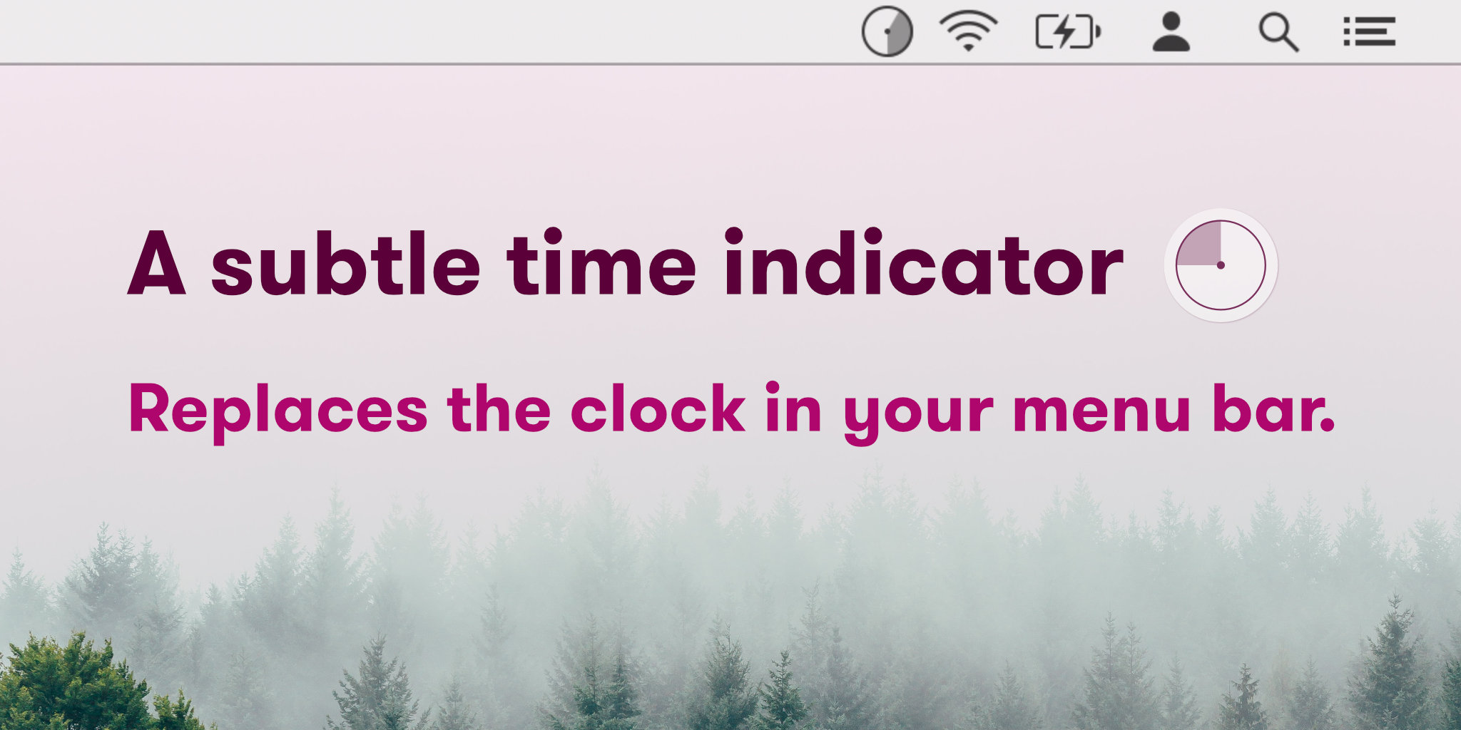
Timeless been in my menu bar since I created the first, rough version and I can’t imagine not using it anymore.
Get Timeless! (12.9 MB)
Used in conjunction with reminders and my calendar, it keeps me from glancing at the clock whenever I’m at my Mac. For me, that’s a huge stress reducer and I’d love to know if it works for you too. 😊
Photo by Filip Zrnzević on Unsplash
December 2019
With DevMate sunsetting in little over a week I’ve issued an update for every app that included the DevMate SDK.
Besides removing the DevMate SDK I’ve also included support for pausing Music.app in macOS Catalina. 👌
You’ll notice that I’ve updated the App Store screenshots as well. I liked the eye piercing background color of the original images, but I think this is a little more appealing. 😅
 After
After
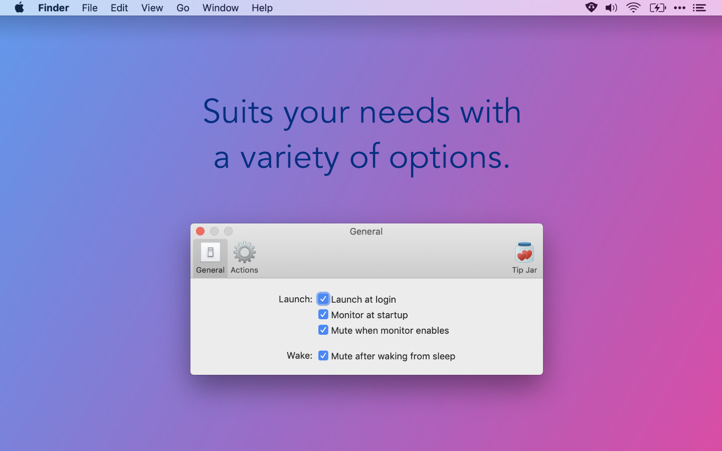 Before
Like Timeless this updates switches the update mechanism from the DevMate SDK to just Sparkle’s update mechanism. Updates are hosted at Microsoft’s AppCenter, for now.
This is getting very close to its initial 1.0 release!
I’ve included an Internet Access Policy to every app that accesses remote resources. With an IAP apps like Little Snitch can display a meaningful message when asking you to allow or block an app’s request to fetch an online resource.
Carbonize benefits from this because it requires access to carbon.now.sh. The message that a firewall like Little Snitch displays reflects that now.
October 2019
Apple chose today to release macOS 10.15 Catalina. The latest major update to the Mac operating system. 🥳
I’ve been testing Denied, Carbonize, Relax, Pipvid and Timeless with every new beta since they came available and I’m happy to report they all work fine.
You’ll get a notification about the update at some point. If you want to upgrade early, open System Preferences and select System Update.
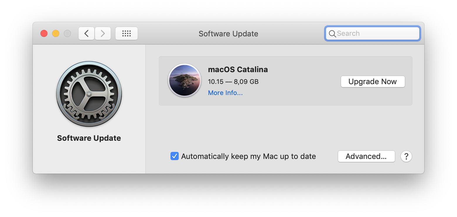
After a moment or two you’ll get the option to Upgrade Now.
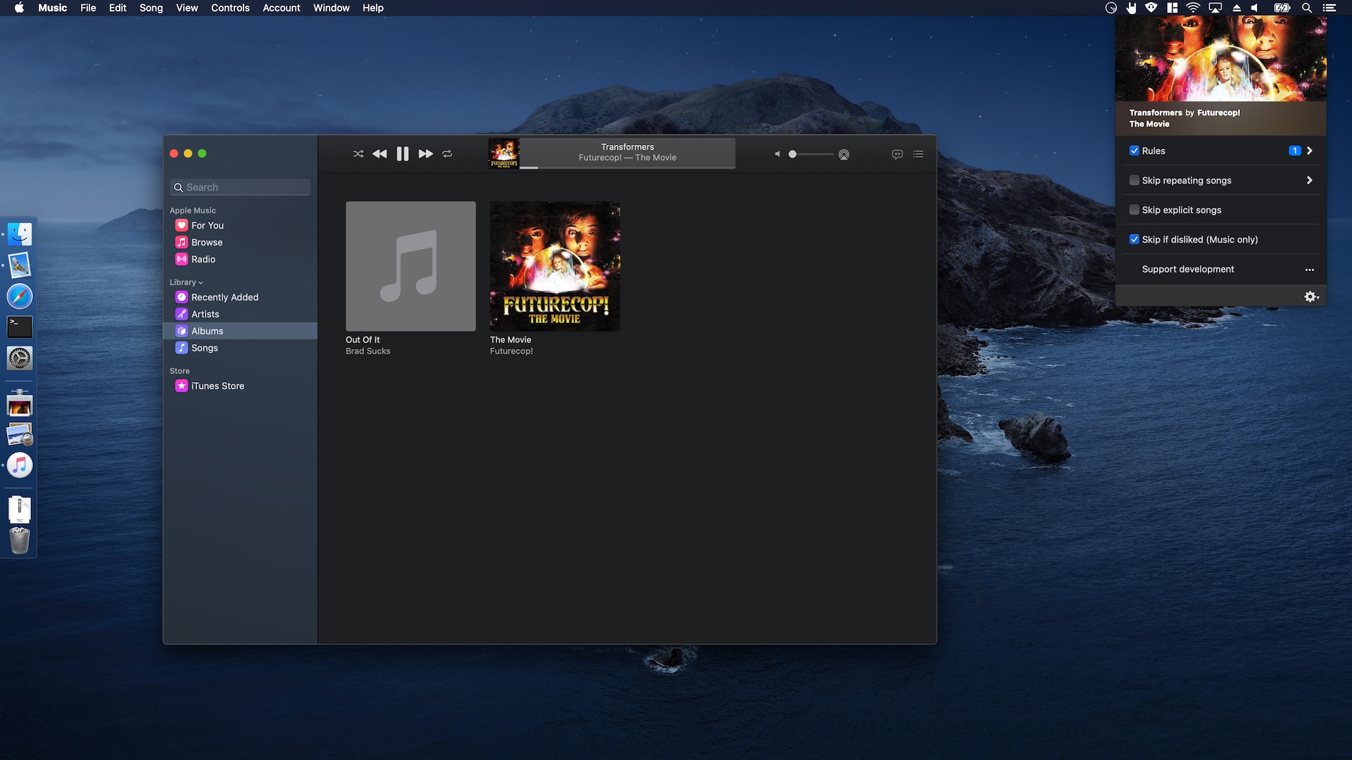
iTunes has been replaced by separate apps for music, podcasts, TV and books. All very appropriately named after the media they expose. I’ve added support for Music.app in Denied v1.7.
Song skipping through all filters works perfectly. There’s an unfixed bug in Music that prevents Denied from grabbing the track information when the app first launches and before Music was set to play, pause, skip to the next or previous track. This is mainly cosmetic. I’m confident Apple will address the issue in a future update to Catalina.
QuickTime gained a built-in picture-in-picture mode in macOS 10.15. I’ve been on the fence about removing my custom solution, now there’s a native implementation.
For the moment I’ve decided to stay with the custom feature I built specifically for Pipvid. The main reason being that my solution allows me to enable and disable picture-in-picture by simply resizing the player window. I love that feature myself.
The new pip-button in QuickTime is easily accessible to those who prefer the native variant.
I’m working on a hybrid solution that could make the best of both options. That’s not quite ready yet.
Carbonize, Relax and Timeless work exactly like they did on macOS Mojave. I hope you’ll enjoy them as much on Catalina as you did on Mojave. 😄
Have fun exploring the new features!
September 2019
I posted Timeless to the Productivity sub-reddit the other day to gather feedback. The entire post is included below. If you’d like to provide feedback on my tool to reduce time anxiety I encourage you to chime in, use the built-in feedback dialog in the beta or contact me on Twitter.
The comments are very encouraging!
Hi there, I’ve been working on Timeless, an app to reduce the Time Anxiety I’ve been experiencing. For me, it manifests like this:
Six months ago I disabled the clock in the top right corner of my screen on my Mac. That worked wonders, but made it hard to stay grounded and remember mundane stuff like getting up to grab lunch. 😅
That’s when I created the small menu bar application that I’d like your feedback on. It’s currently available for free as a beta on usetimeless.app.
It works by setting time ranges that are then indicated in the corner of your screen instead of an actual clock. This means that when it’s 9.45am you might see a range that shows that it’s between 8am and 12pm. For me this reduces the mental burden some hours of the day give me, while still allowing me to naturally get through the day without feeling like a robot and setting tons of reminders. (I still set reminders for important events.)
I think it’s great, but I’d love for more people to try this approach and let me know what they think. I’m curious to find out if this is something that can be applied universally, and if there are features missing. In the last update for example, I added the option to only show the indicator on certain (work) days and just show the time when the indicator is idle.
Let me know what you think!
(The app is currently only available for macOS. I’ll start on a Windows version when I’ve gathered enough feedback. If you’re on Windows and still would like to help, disabling your clock and letting me know how it affects your day is very useful information to me!)


September 2019
I’m delighted by the feedback I received from the people who downloaded the Timeless beta over the past two weeks. The two most requested features were:
The latest update addresses both these requests with a new scheduling feature and the option to show a regular old clock when the indicator sits idle.
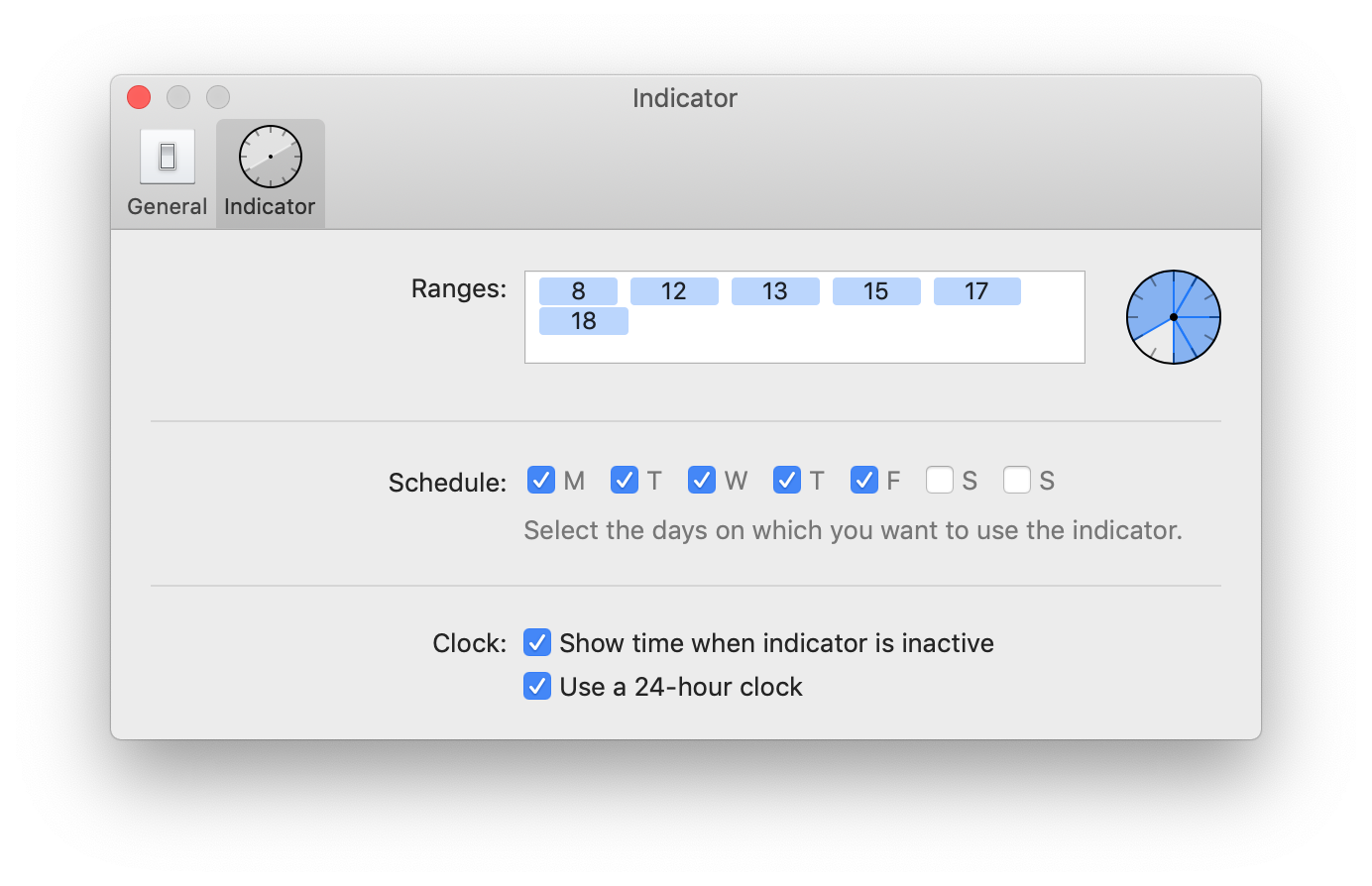
This means you can display the time before and after your timeless period starts and during the days you’re not working. The main goal is to reduce friction when giving Timeless a go.

If you haven’t already, I’m hoping you’ll install the new beta and let me know what you think.
The beta includes a built-in feedback dialog that you can use.
August 2019
After using Timeless myself for weeks and tweaking the experience, it’s finally time to share the first beta version with you. I’m very excited about this. Try Timeless now.
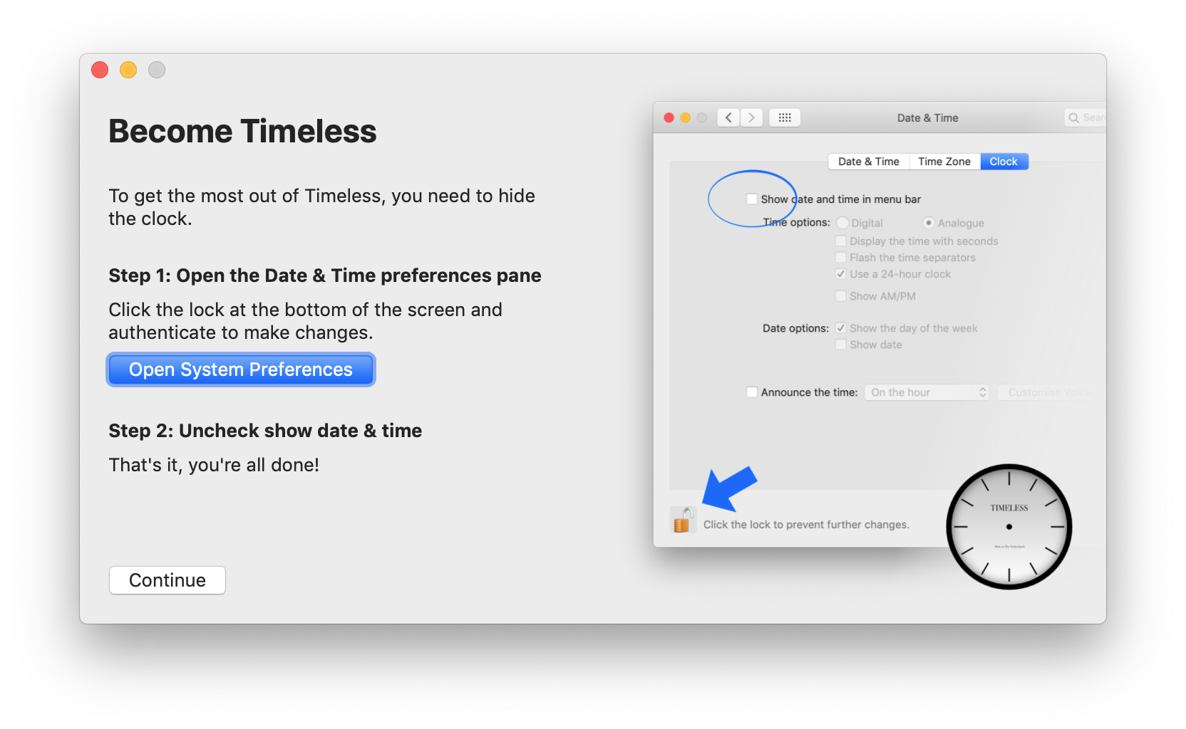
Hiding the clock from the corner of my eye and switching to the less specific indicator of Timeless has allowed me to be more productive while reducing anxiety. I’m curious to hear if it does the same for you.

After launching the app for the first time, the setup wizard will help you get started by completing the tasks below.
July 2019
I’m working on a more natural way of getting the most out of my day: it’s an app called Timeless. At its core it gives me a generic sense of what part of the day I’m in: morning, lunch time, noon etc.
Instead of breaking concentration or induce stress it lets me continue working when I’m still in the time bracket I’m expecting to get stuff done. Then, in a glance, it lets me know that I’ve entered a new part of the day. If it’s between 12pm and 2pm I should probably get lunch.
There’s no notification to ‘get lunch now’, just a hint that when I’m ready I should probably go grab something to eat.
Even when combined with more urgent interruptions, like water breaks, it allows me to comfortably get back to work. I don’t feel any pressure or hesitance because of how much time I have left in the day.
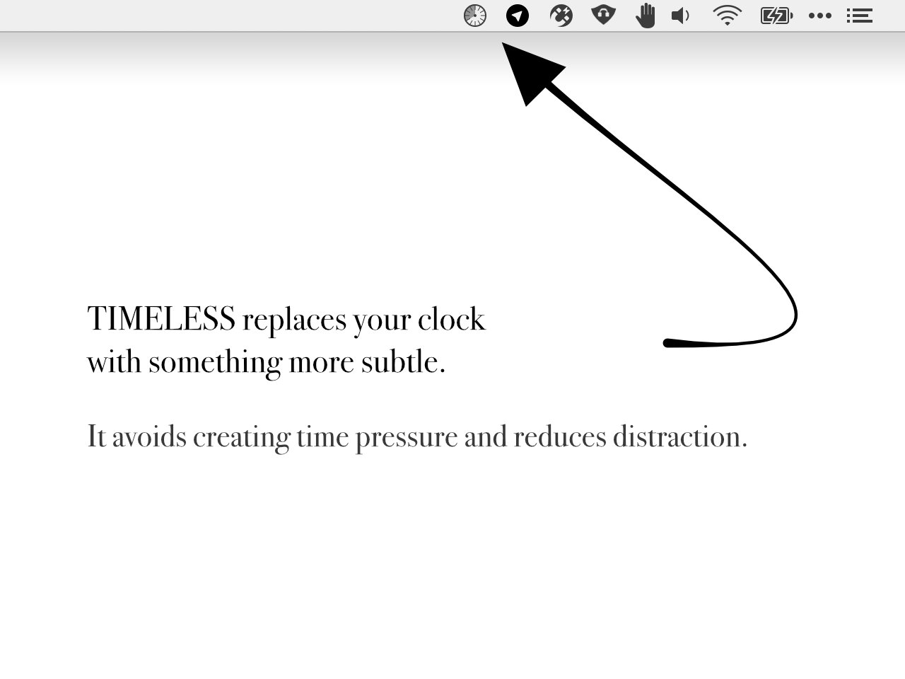
I’m getting ready to let others give this a go as well. If you’d like to be invited to try the beta, subscribe to the mailing list. Thanks!